PROCESS
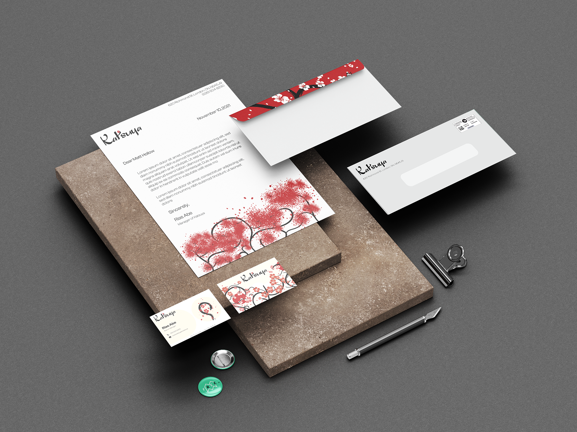
I rebranded Katsuya restaurant with a design inspired by Japanese heritage, specifically Sakura. I used Illustrator to illustrate the trees and their petals on the cover letter and envelope, as well as the sakura flower on the business card.
I also prepared a mockup using Photoshop.
I also prepared a mockup using Photoshop.
MEDIUM/TOOLS USED
Adobe Photoshop, illustrator
Pegasus Beer Advertisement
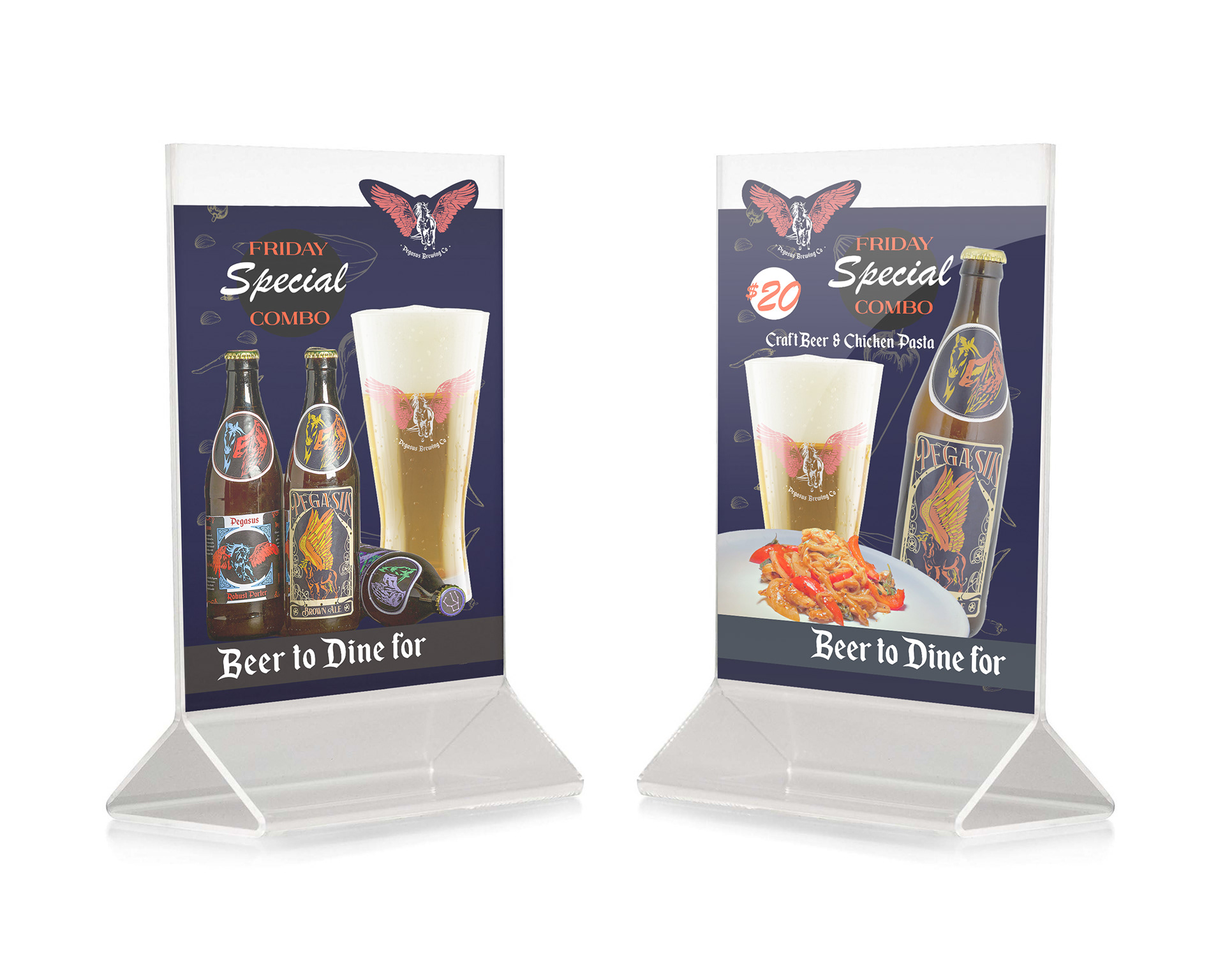
Table talkers
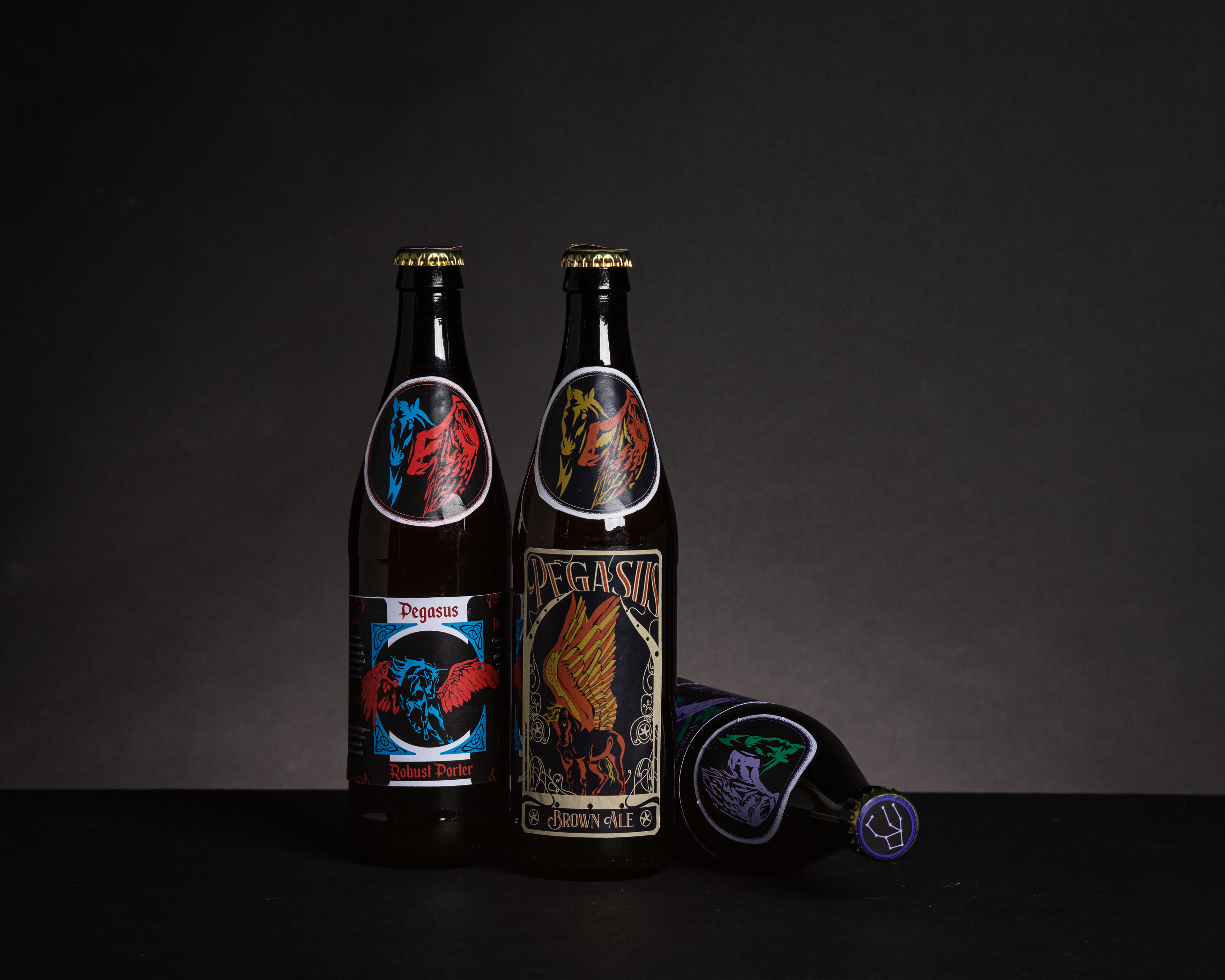
Pegasus Beer Photoshoot
Process
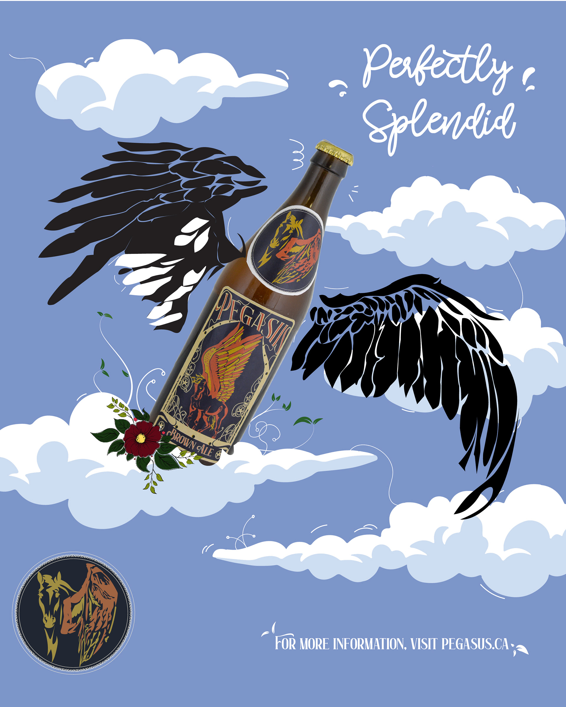
I chose the pegasus as a symbol for my idea because mythical creatures are one of the great conversational starters. Not only do people come in for a beer and a good time, but the exquisite design could be an add-on to any conversation. After finalizing a logo for my Pegasus beer, I decided to showcase the Pegasus beer label along with an art nouveau border. A mythical creature and art style from the past come together as a strong design.
A strong design speaks to its viewers and could also offer a personalized experience in regards to the brand. I also gave my colour choices a good amount of thought because they affect the way we feel about products. So, choosing a bold color that represents richness added more credibility to my design.
Medium/Tools used
Adobe Illustrator, InDesign
Process
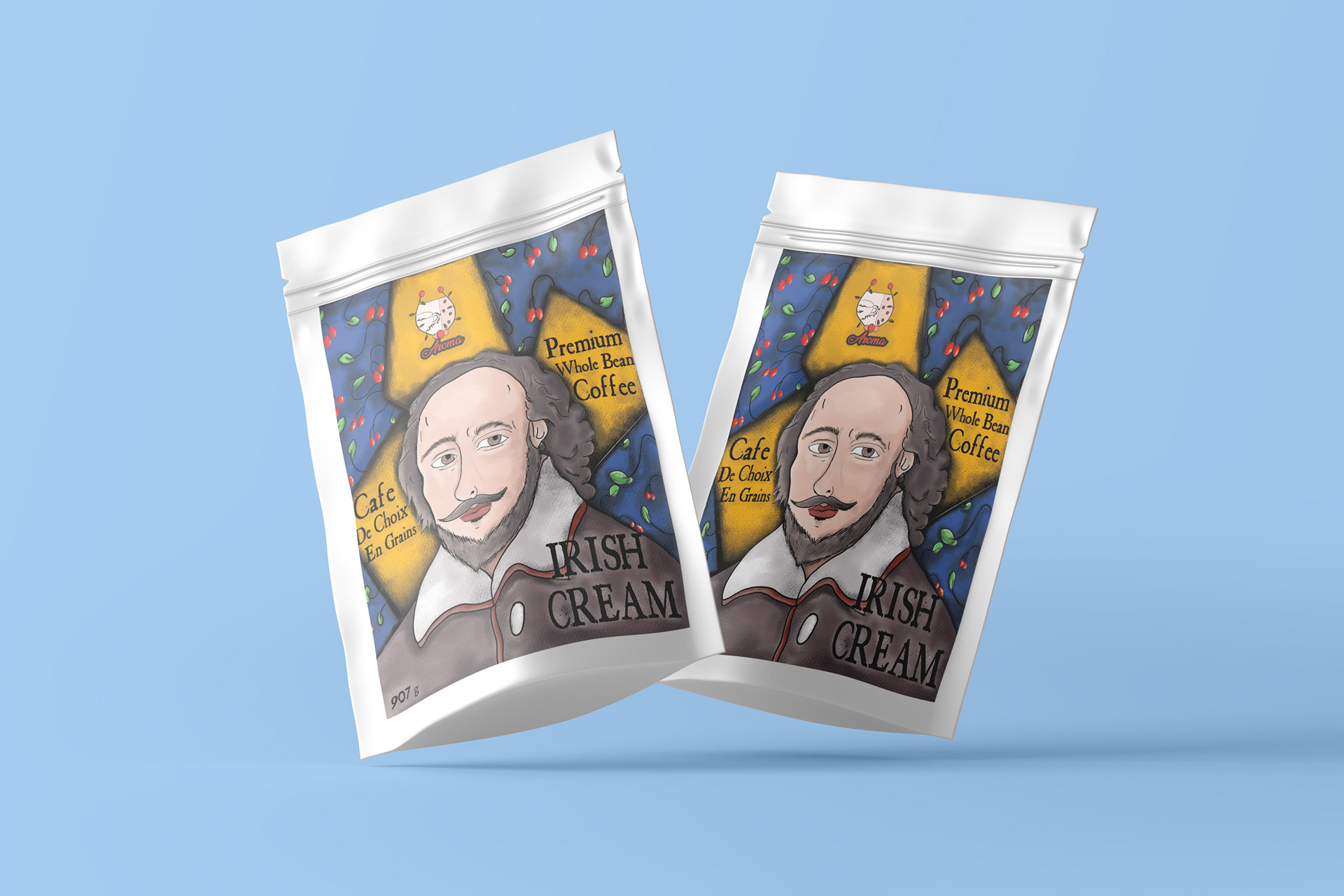
I sketched a design for my coffee packet having a shakespeare portrait as a center piece and there’s a 2 color pattern in the background with berries and vines. After scanning the sketch using adobe scan app, I imported it into photoshop, drew on top of it using a black brush.
Now, I needed a custom chalk textured brush to paint in my artwork and for that I imported another image of a chalk texture drew on a paper. I had the texture selected and made it into a brush using photoshop tools. After finishing the packaging, i made some mockups using photoshop as well.
Medium/tools used
Adobe photoshop
Signage
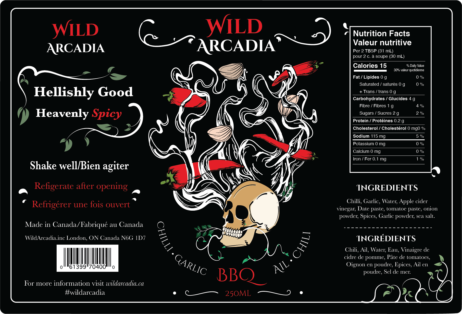
BBQ sauce label
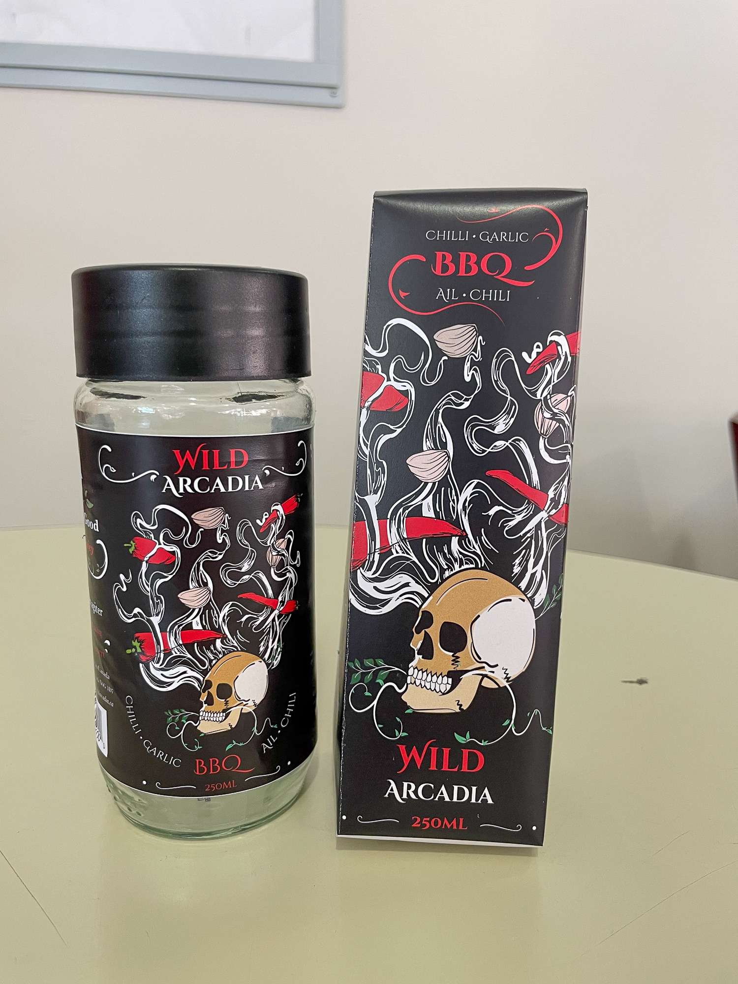
BBQ sauce mockups
Process
I designed the label in Illustrator, making use of a skull, smokes, chili, and garlic as the key features. Because this graphic would be the focal point of my label, I designed the smokes to provide the appearance of heat or fumes, linking it to the hotsauce category in barbecue. After finishing it, I created a logo and combined the materials in InDesign using appropriate understandable, visually appealing fonts and a nutritional chart. I also made a mockup in Photoshop.
Medium/tools used
Adobe Illustrator, Photoshop
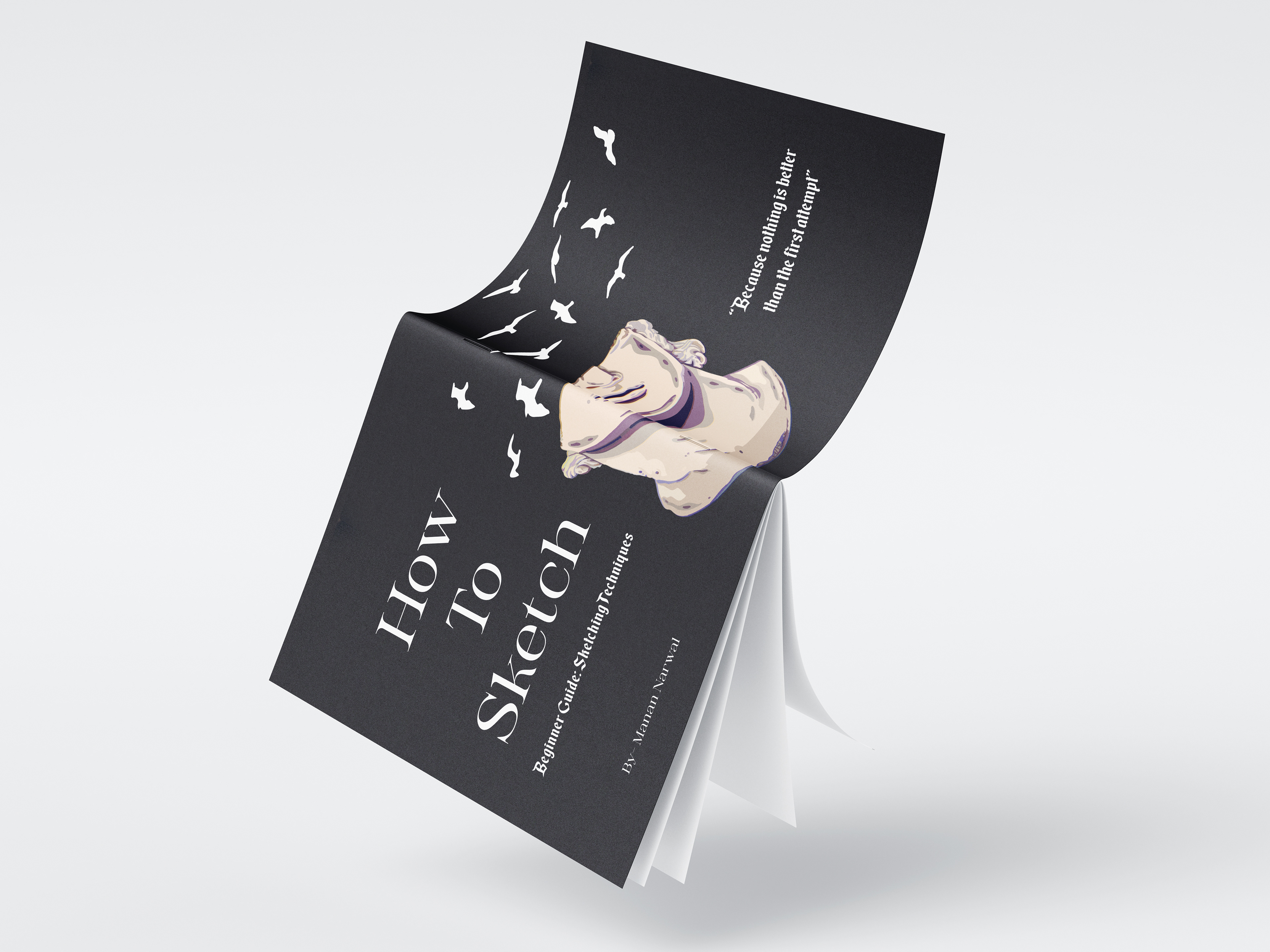
Front cover
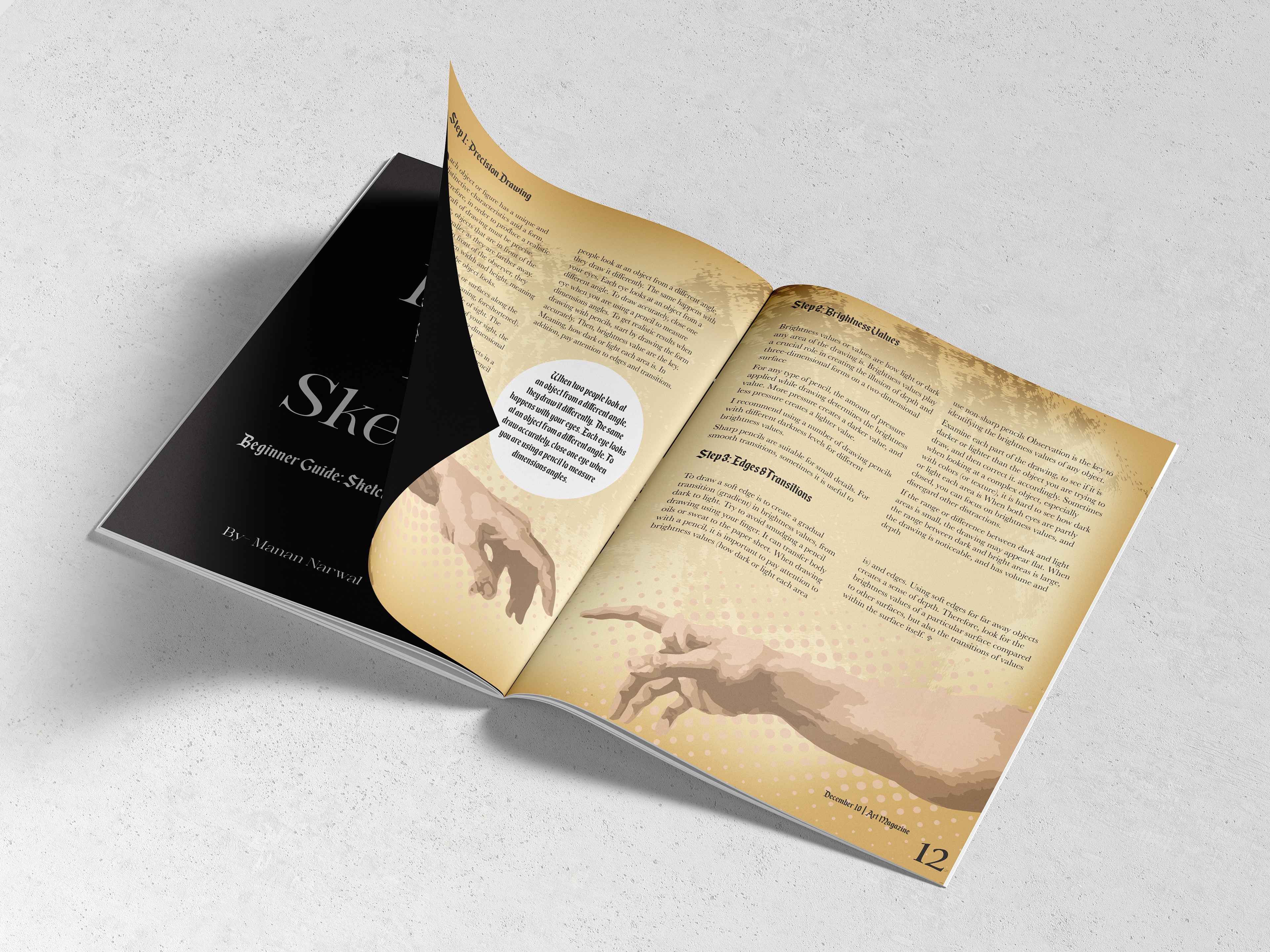
Inside the magazine
Process
To create the magazine's components, I illustrated a burnt-scroll paper background to which I could add body text. For the front page, I designed David's head from the famed David sculpture, as well as the birds and hands from Michalangelo's painting, to serve as a slightly faded design element background on the brunt scroll paper. These striking and visually appealing works of art will undoubtedly grab the proper audience and leave you wondering. After compiling the artwork on a magazine spread in InDesign, I exported a pdf to build more prototypes in Photoshop.
Medium/tools used
Adobe Illustrator, Photoshop
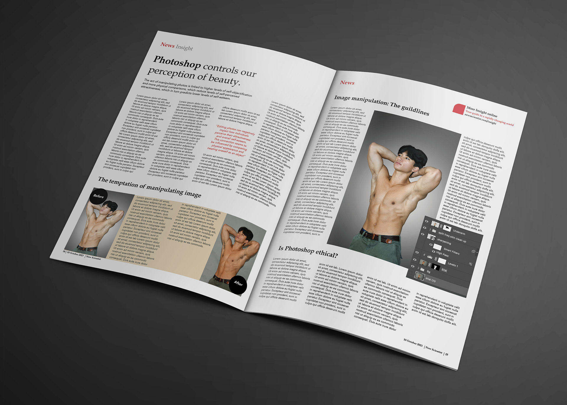
Process
After photographing my friend, I used Photoshop to alter the image by masking, sharpening, and correcting highlights and shadows. Following the adjustments, I applied a simple gradient background to a much improved and clearer edited image. Furthermore, I exported the Photoshop file to an InDesign file and inserted it in a magazine article layout that I designed from scratch.
Medium/tools used
Adobe Photoshop, Indesign
Process
To design a cover for a work of art, symbolism must be used to symbolize the themes and elements contained within. So I created the necessary pieces in Illustrator, as well as the proper font to complement them.
After putting it on a book cover in InDesign, I used Photoshop to produce a mock-up of my finished composition.
Medium/tools Used
Adobe Illustrator, Indesign, Photoshop
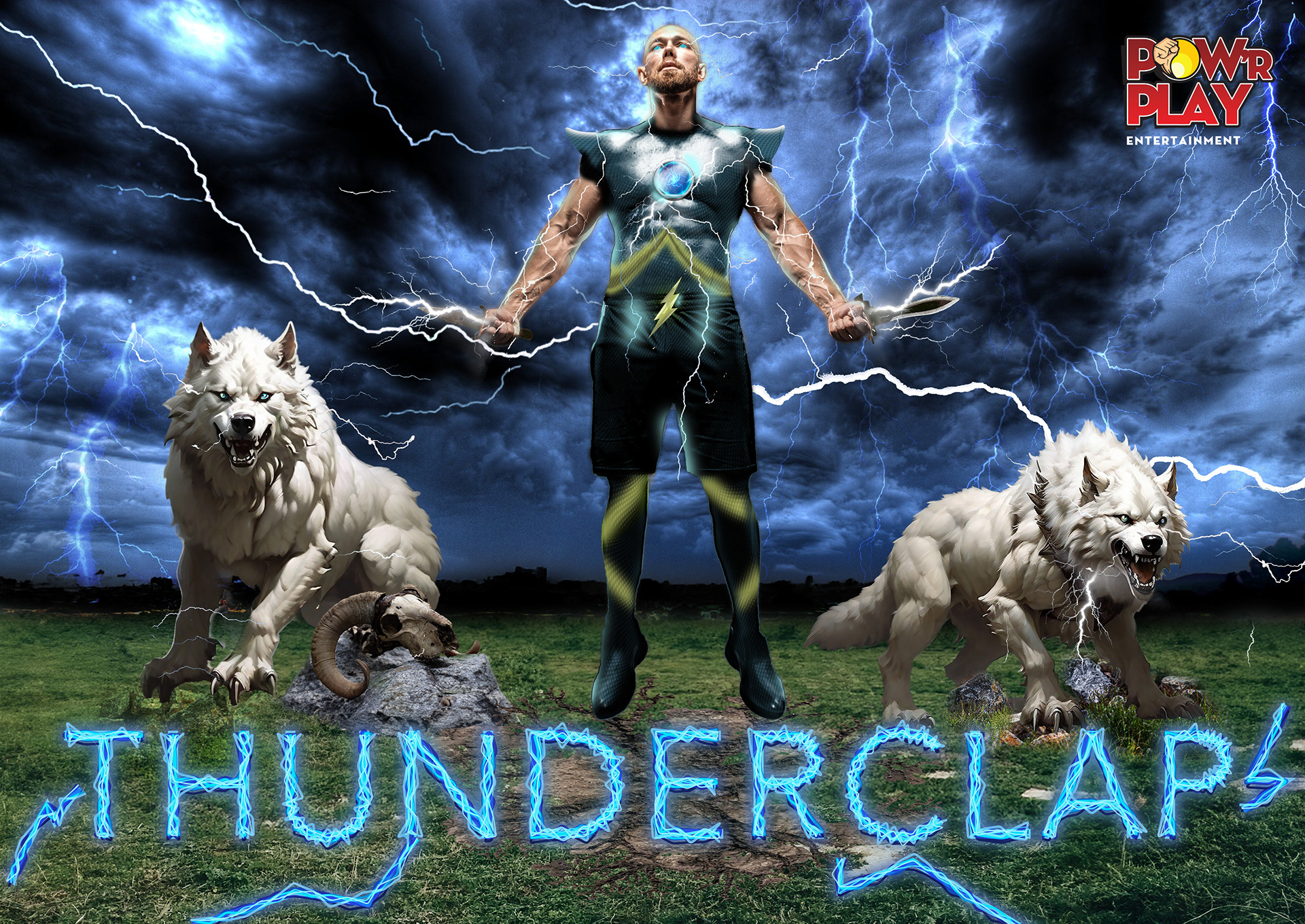
PROCESS
I used Photoshop to design a body suit for my hero, then adjusted and altered the lighting around him and the background to blend them together as one scene, changing the hues and saturations. Also, I used colour correction to merge the wolves in the scene. I illustrated the title with many lines layered with different tints and tones of blue.
MEdium/tools used
Adobe photoshop
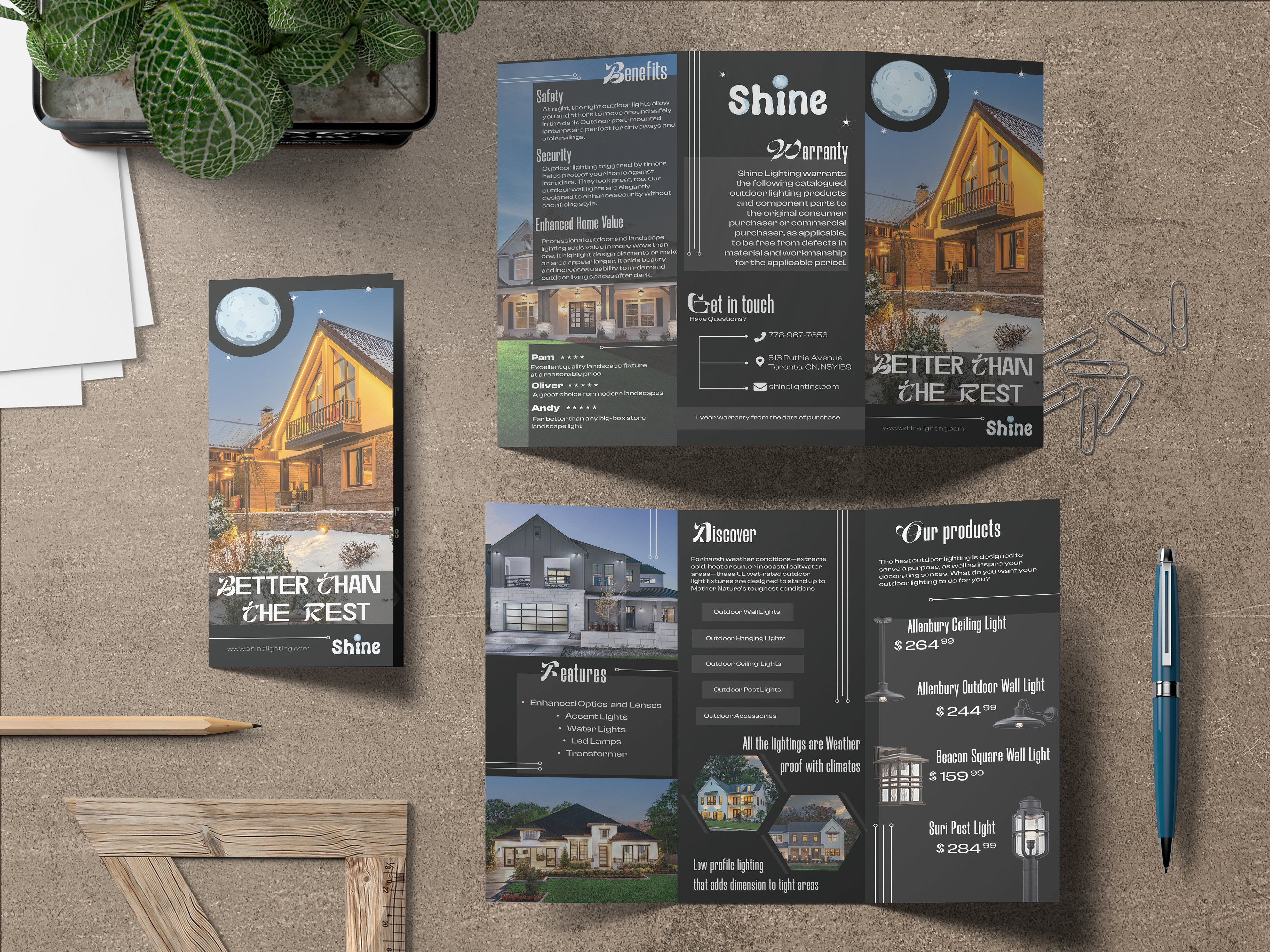
PROCESS
After gathering all of the necessary images for this outdoor lighting company's brochure and editing them in Photoshop to the appropriate tone of levels, hue, and saturation, I placed them and designed this three-flap panel brochure in InDesign, which provided me with a wide range of control and freedom in manipulating text and where to place it.
After finishing the design, I made a mockup in Photoshop.
Medium/tools used
Adobe InDesign, Photoshop
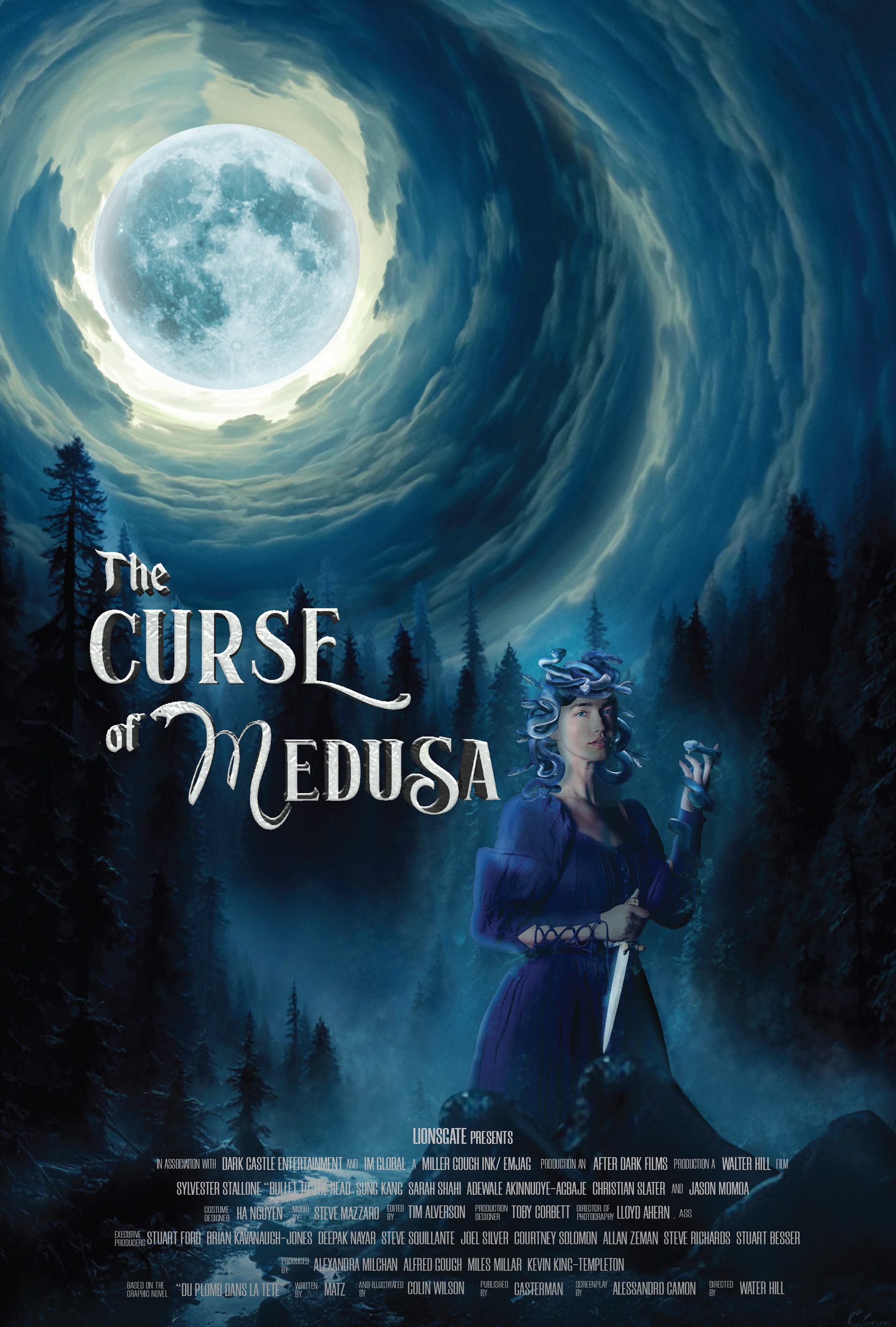
process
I used the story of Medusa as the basis for my fantasy poster, with the idea that Medusa is standing alongside a river in a dark forest with tall trees, with a full moon in the background and spiral clouds across the sky. After masking the lady from the picture I liked, I added blue snakes on her head as hair and one around her hand. on make the snakes merge better, I adjusted the lady's highlights and shadows to a blue colour shade. I created the spiral cloud and blue mist surrounding the medusa with Photoshop tools. After blending the forest, sky, and medusa, I set the levels of the entire scene to the same hues to provide depth and authenticity. I finished the posters by putting the title of the film and the credits at the bottom.
Medium/tools used
Adobe photoshop